• Welcome to the most helpful Affiliate Marketing Forum. Join us! CLICK HERE for our membership options.
  • POWER HOUR: 🚀💰 Master MULTI-CHANNEL Magic to Earn RECURRING Monthly Income! 💸🔥" Join Us! CLICK HERE FOR DETAILS
  • 📊 Latest Follow Along - $10,000 a Month Website Case Study 💡 Join the Discussion

email campaigns: mobile devices vs. desktop

optimizepress
B

brenda

Guest
how readers interact with email campaigns on mobile devices vs. the desktop according to reports

- subscribers tend to open emails more on their mobile devices
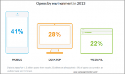
opens.png

when you send an email campaign it is likely that your subscribers are opening/reading it on an iPhone, tablet or similar device
it's only smart to optimize your email campaigns for mobile
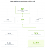
opens1.png
 
C

clickman

Guest
very helpful info brenda
totally agree that click through rates on email campaigns has shifted towards mobile devices for the past 4 years and growing since

your reports show that emails are more consumed on mobile devices or similar
and as you wrote "it's only smart to optimize your email campaigns for mobile "

i'd like to share some design and layout tips when designing for mobile
  • Single-column layouts (no wider than 500 to 600 pixels)
  • as per Apple guidelines: Links and buttons should have 44 × 44 pixels min. target area
  • text should be 13 pixels minimum font size for iPhones
  • keep your message concise and straightforward, putting all important design elements in the upper part of the email.
  • know when and when not to use social sharing buttons since they are not always easy to use by the recipient on mobile devices.
 
L

lukedice

Guest
very helpful info brenda
totally agree that click through rates on email campaigns has shifted towards mobile devices for the past 4 years and growing since

your reports show that emails are more consumed on mobile devices or similar
and as you wrote "it's only smart to optimize your email campaigns for mobile "

i'd like to share some design and layout tips when designing for mobile
  • Single-column layouts (no wider than 500 to 600 pixels)
  • as per Apple guidelines: Links and buttons should have 44 × 44 pixels min. target area
  • text should be 13 pixels minimum font size for iPhones
  • keep your message concise and straightforward, putting all important design elements in the upper part of the email.
  • know when and when not to use social sharing buttons since they are not always easy to use by the recipient on mobile devices.


coding also plays a vital part for a mobile-friendly design
 
C

contentisking

Guest
very helpful info brenda
totally agree that click through rates on email campaigns has shifted towards mobile devices for the past 4 years and growing since

your reports show that emails are more consumed on mobile devices or similar
and as you wrote "it's only smart to optimize your email campaigns for mobile "

i'd like to share some design and layout tips when designing for mobile
  • Single-column layouts (no wider than 500 to 600 pixels)
  • as per Apple guidelines: Links and buttons should have 44 × 44 pixels min. target area
  • text should be 13 pixels minimum font size for iPhones
  • keep your message concise and straightforward, putting all important design elements in the upper part of the email.
  • know when and when not to use social sharing buttons since they are not always easy to use by the recipient on mobile devices.


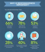
found more info that suggests your accounts were true
responsiveness.jpg
 

Newest Resources

Sponsors

semrush
Top